


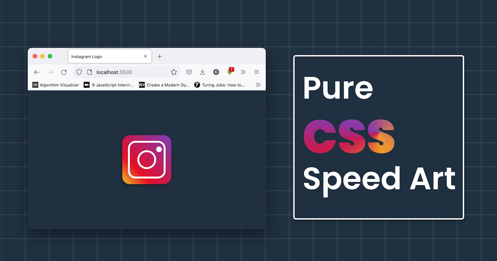
In this (mostly code, "little plain text") post, I show you how I created an Instagram logo using CSS only. You can find the full source code here: CodePen
First, the structure of the logo, (this is the HTML part).
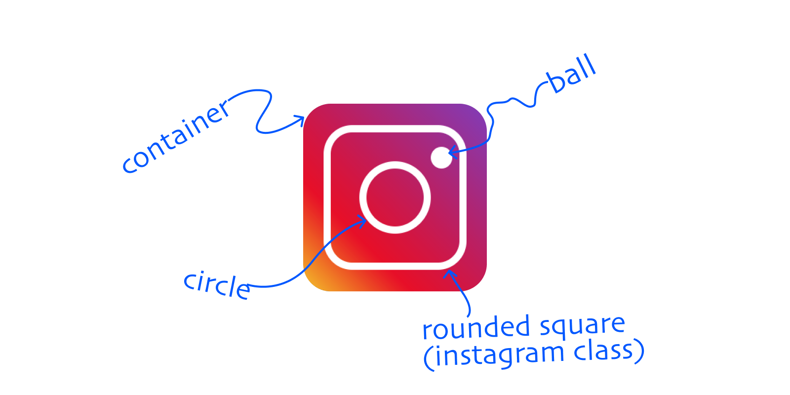
The Instagram logo we are working on today is a gradient background and a rounded square with two circles, one in the center and the other in the top right to represent sort of a camera.
So to structure this, we will create a container class for our background containing an Instagram class that contains two classes circle and ball.
<div class="container flex">
    <div class="instagram flex">
      <div class="circle"></div>
      <div class="ball"></div>
    </div>
</div>
Positioning and Style - CSS
We will first style our body to remove the presets on the margin and padding and then center the contents.
body {
  margin: 0;
  padding: 0;
  box-sizing: border-box;
  width: 100vw;
  height: 100vh;
  display: flex;
  justify-content: center;
  align-items: center;
  background-color: #fff;
}
container class
Then we will work on the container which will have the linear gradient as its background, plus the flex class which is shared by the container and Instagram classes in HTML. I have also added a animation zoom which I will work on last.
.container {
  padding: 15px;
  background: linear-gradient(225deg, #7f37be, #ea041e 70%, #f6c900);
  border-radius: 20px;
  box-shadow: -3px 3px 10px rgba(0, 0, 0, 0.3);
  animation: zoom .2s;
}

.flex {
  display: flex;
  justify-content: center;
  align-items: center;
}
instagram class
The Instagram class is a rounded square so we will give it a border of 5px plus a medium border-radius, I went with 20px. then notice that I give it a position of relative, this is to help when positioning the ball.
.instagram {
  position: relative;
  border: 5px solid #fff;
  padding: 20px;
  border-radius: 20px;
}
circle class
.circle {
  padding: 20px;
  border: 5px solid #fff;
  border-radius: 50%;
}
ball class
.ball {
  position: absolute;
  width: 15px;
  height: 15px;
  background-color: #fff;
  top: 10px;
  left: 70px;
  border-radius: 50%;
}
Finally, let's give our logo a little zoom animation at the start.
@keyframes zoom  {
  0% {
    transform: scale(0);
  }
  80% {
    transform: scale(1.75);
  }
  100% {
    transform: scale(1);
  }
}